BSc in Computers & InformationMinia University, Egypt
Product Management MasterclassMoaaz Elmasry
UI / UX Design, practical courseMahmoud Ishac
UX Advanced CampTremolo
About
A product designer who thinks like a product manager
I turn business goals into products that ship.
I work closely with stakeholders and developers, from defining requirements and Jira tickets to reviewing each build and making sure the final product matches both the design vision and the business intent.
My process is simple: Understand → Build → Test → Launch → Learn → Improve
At Waffy, this approach helped turn escrow, an unfamiliar financial concept, into a product trusted by 150K+ people.
I also build systems that help teams move faster:
A scalable design system across five product surfaces.
A custom Figma plugin that syncs localized copy with production.
An AI-driven workflow that accelerates design and delivery without sacrificing quality.
Quick facts
LocationEgypt
Experience6+ years
CurrentProduct Designer, Waffy
Open toProduct Designer · Associate Product Manager
LanguagesArabic (native) · English
InterviewsAvailable on-site
Open to new opportunities
Let’s talk
I’m open to Senior Product Designer and Associate Product Manager opportunities.
Designing a trusted escrow experience for 150K+ users
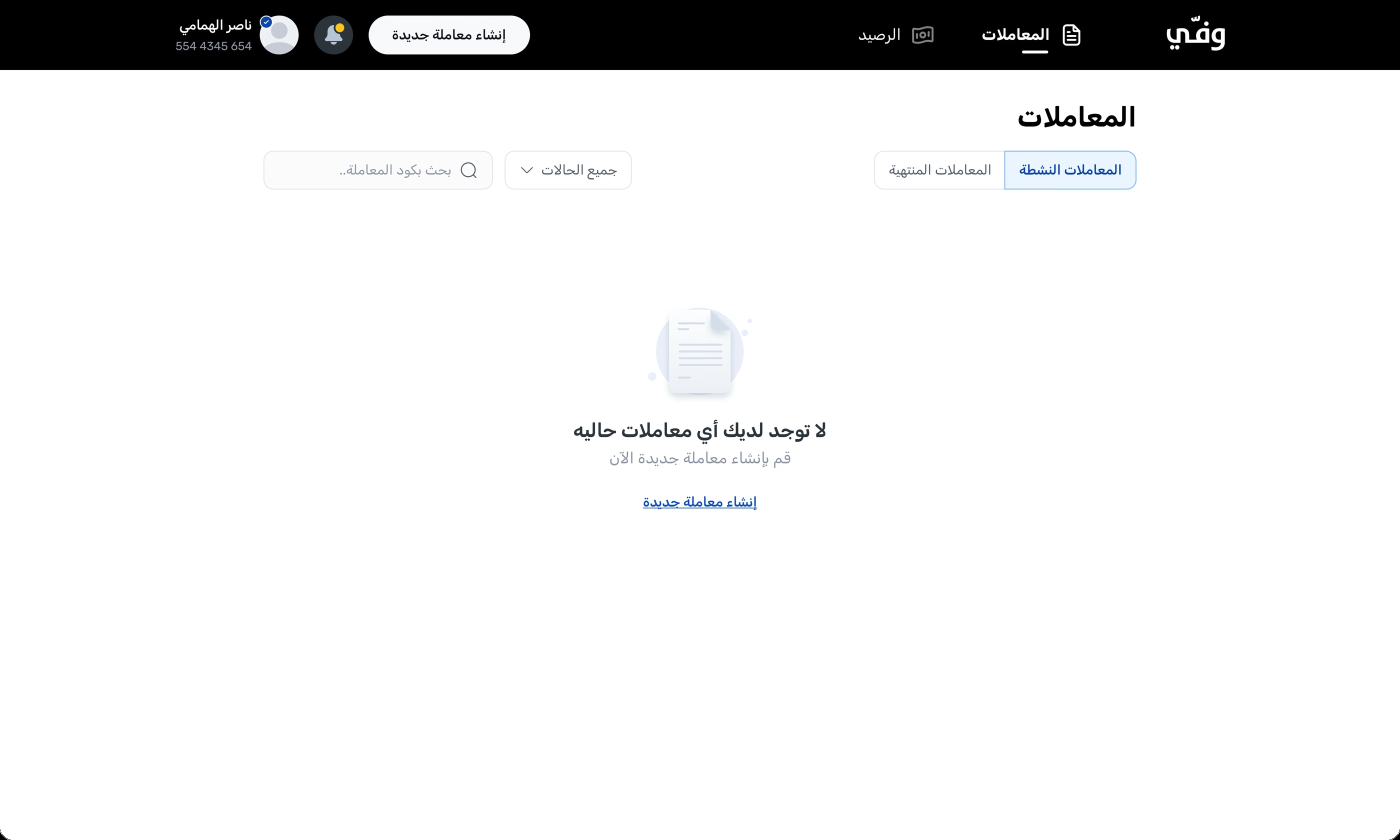
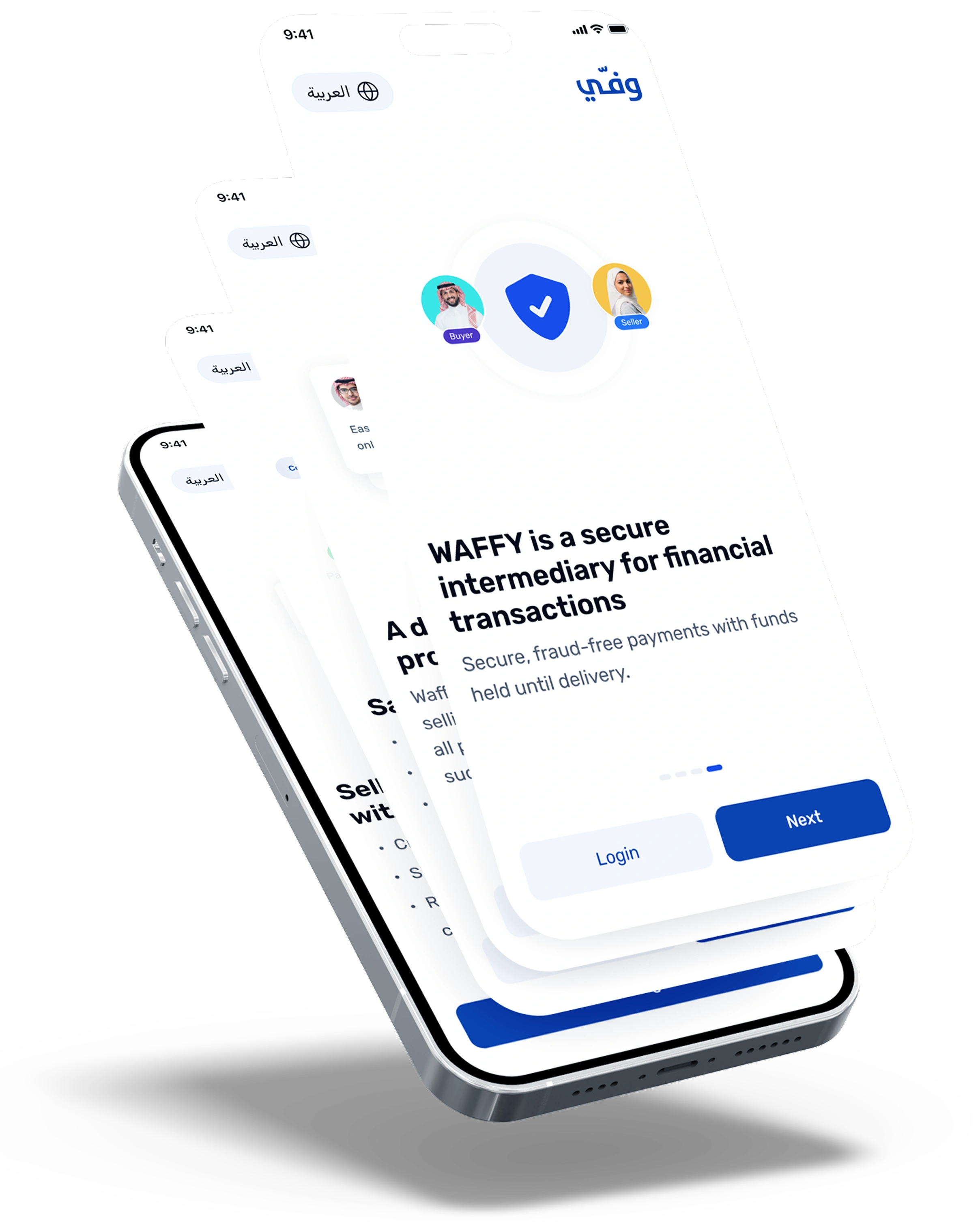
Waffy is a Saudi escrow platform that holds the buyer’s payment until the item is received and approved. I designed the experience across the customer app, business dashboard, and admin platform.
Payment held securely
Buyer inspects the item
Payment released after approval
RoleSolo Product Designer
SectorFintech · Escrow
StatusLive & growing
01 · Impact
The impact behind the work
Transaction volume
0 SAR40M+ SAR
Processed through Waffy
↑ Growth
Registered users
0150K+
people have used Waffy since launch
↑ Growth
Signup drop-off
45%8%
Reduced signup drop-off by simplifying the registration flow
↓ 82% fewer people lost
Unnecessary escalations
65%Redesigned
Two thirds of escalations only needed support, not a dispute.
↓ Support load
Brand personality
Brand personality
Waffy helps people exchange money safely, even when they don’t know each other. These four principles guided how the product looks, communicates, and works.
01Trusted
02Clear
03Reassuring
04Efficient
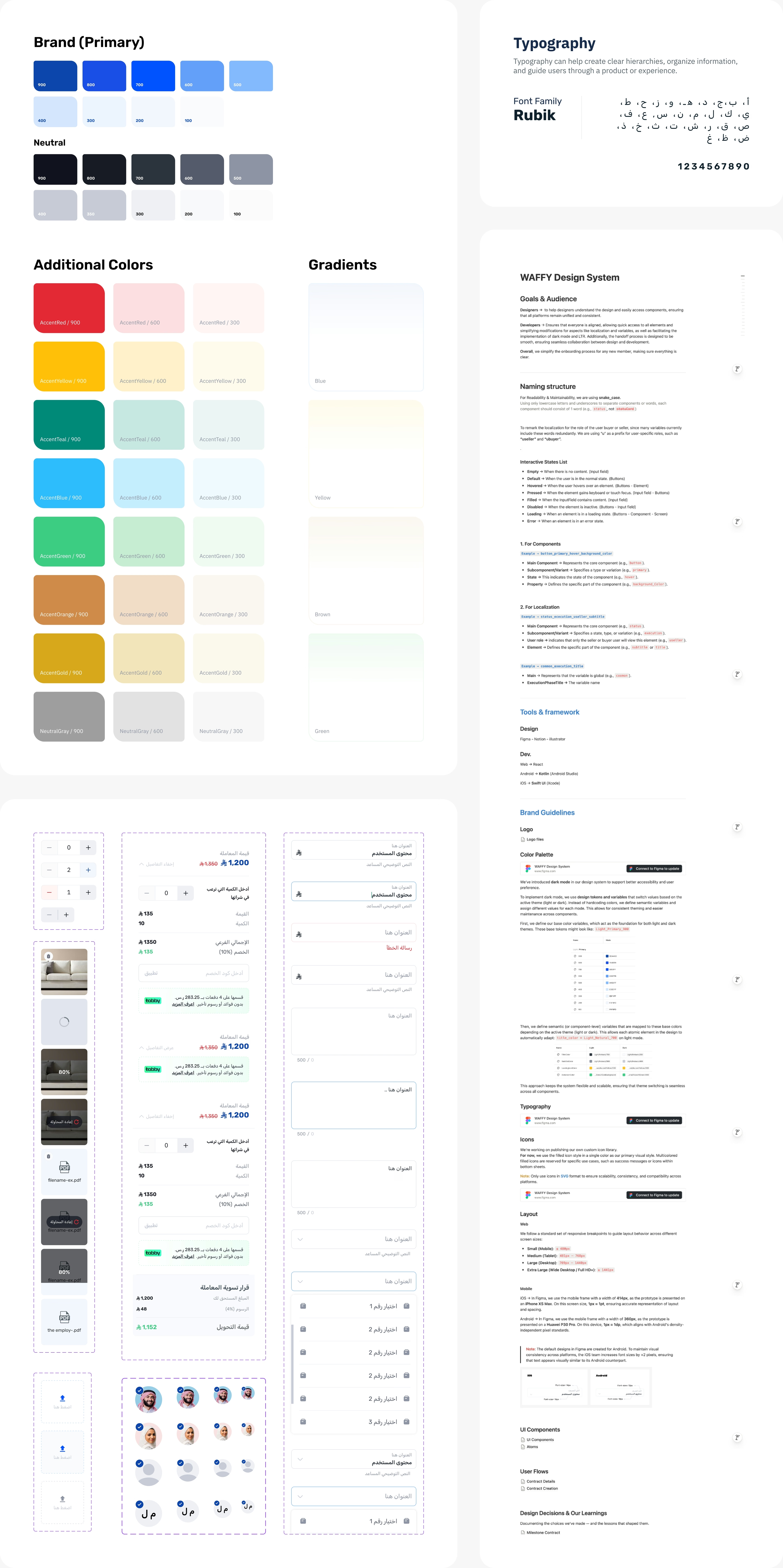
02 · Design system
Design system
One system: tokens, components and patterns, with written documentation so product, design and engineering speak the same language.
01Components
Reusable components with documented variants and states, including buttons, fields, badges, steppers, sheets, and tables.
02Tokens
Shared foundations for color, typography, spacing, radius, and elevation across all three products.
03Documentation
Usage guidance and do/don’t examples that help designers and developers implement components consistently.
03 · Research
How I decide what to build
I combine user interviews, design sprints, behavior data, and A/B testing to understand the problem before designing a solution. The flows below show how those findings shaped the product
01Google Design Sprint
Compress weeks of debate into one structured week: map, sketch, decide, prototype, test.
02User interviews
Talking to real buyers and sellers helped me understand their concerns, expectations, and decisions throughout the transaction.
03Behavior analysis
Heatmaps, recordings and funnels to see where people actually hesitate and leave.
04A/B testing
I compared different versions of screens and copy to understand which one performed better.
Buyer and seller journey mapI mapped both sides of the transaction to identify pain points and areas for improvement.
The transaction flow, end to endI mapped the seller, buyer, and admin paths together to show each state, decision, and dependency from payment to completion.
Contract creation flowThe main steps and decisions users go through to create and share a contract.
06 · System feedback
Keeping users informed at every step
Each transaction includes several updates across buyers, sellers, and admins. I designed notifications to reach the right person with a clear status and the next action they need to take.
07 · Conversion
Signup drop-off: 45% → 8%
Nearly half of new users left before completing registration. Hotjar recordings showed where they stopped, while interviews helped explain why: the six-step flow asked for too much information too early.
I simplified registration to a phone number and OTP. Users now complete their profiles later, when the information is needed. After the change, drop-off fell from 45% to 8%.
Before
6steps to get in
Full registration form, identity details and verification, all upfront, before seeing a single screen of the product.
After
2steps to get in
Phone number, then OTP. Straight into the app, with profile completion prompted later, in context.
08 · Operational insight
65% of escalations were not disputes
Behavior and support data showed that most escalations were users asking for help or reporting technical issues. Since escalation was the only visible option, these requests were sent to the support team as disputes.
I redesigned the flow to separate support requests from actual disputes, helping users choose the right path and reducing unnecessary work for the support team.
Before
One path for everything. Confusion, technical issues and real disputes all became formal escalations. Slow for users, expensive for support.
After
Intent separated at the entry point: get support, report a technical issue, or escalate a genuine dispute. Each path has its own flow and expectations.
05 · Scope
Three products, one design language
C2C
Customer experiences across iOS, Android, and web, supported by an internal admin platform.
B2B
Escrow tools for business transactions, with workflows and controls designed for larger deals.
Partner integrations
Waffy flows embedded into partner products, allowing their users to complete escrow without leaving the experience.
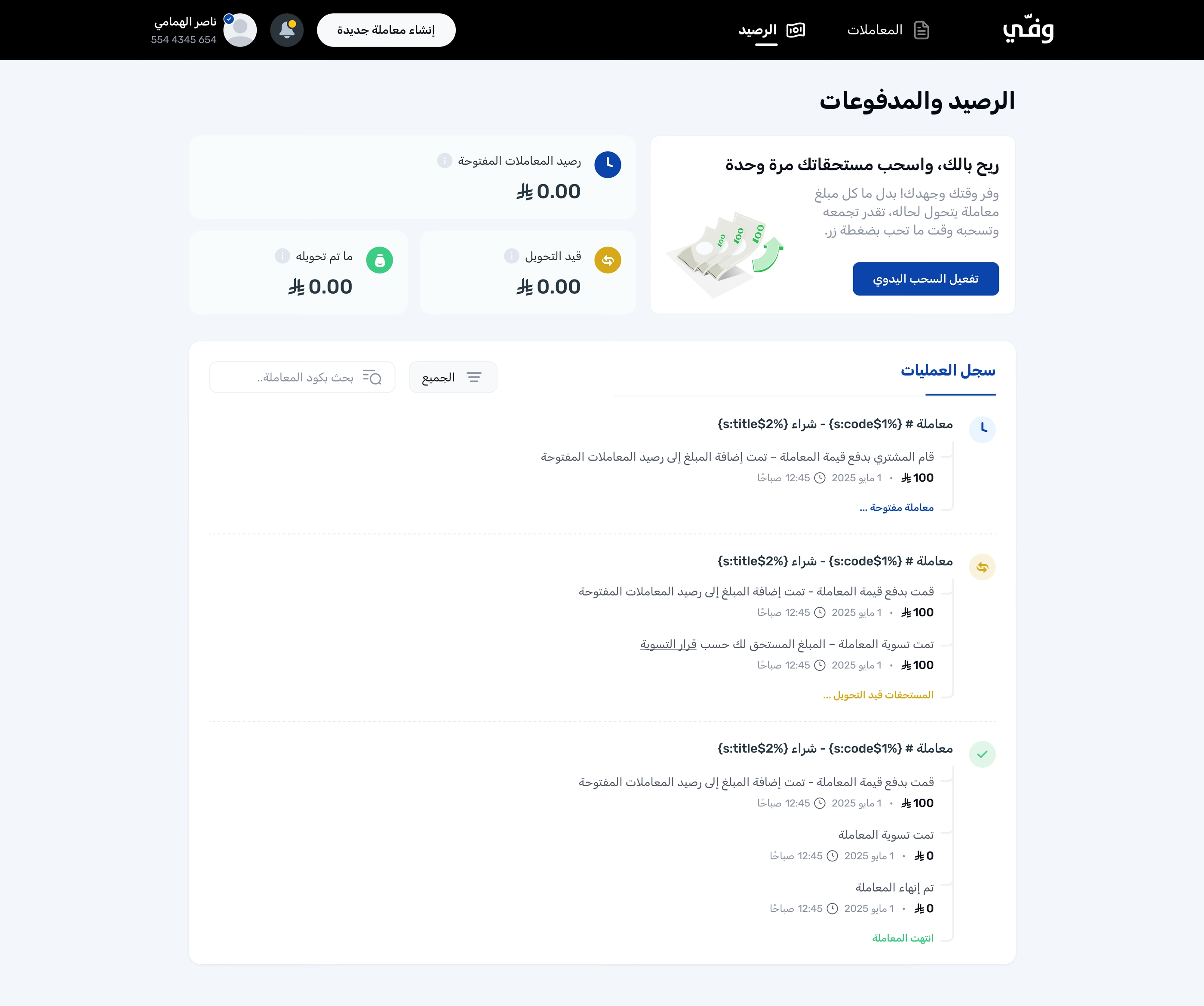
System screens
The journey, end to end
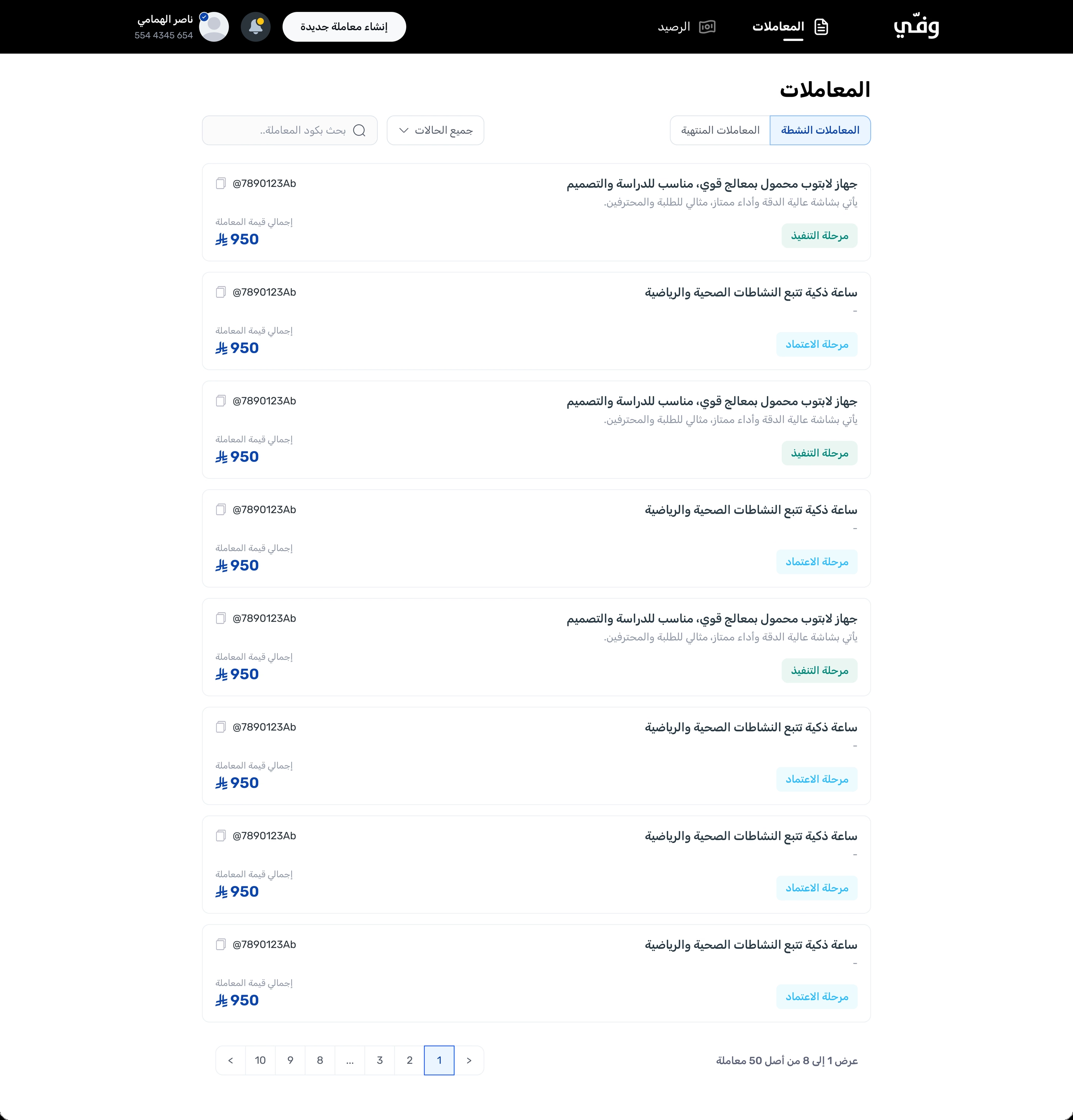
App screens
A closer look inside the app
THANK YOU
Open to new opportunities
Want to go deeper? Let's talk
Process, decisions and outcomes, happy to walk through them in person or on a call.
Should grocery shopping still mean browsing thousands of products in the age of AI?
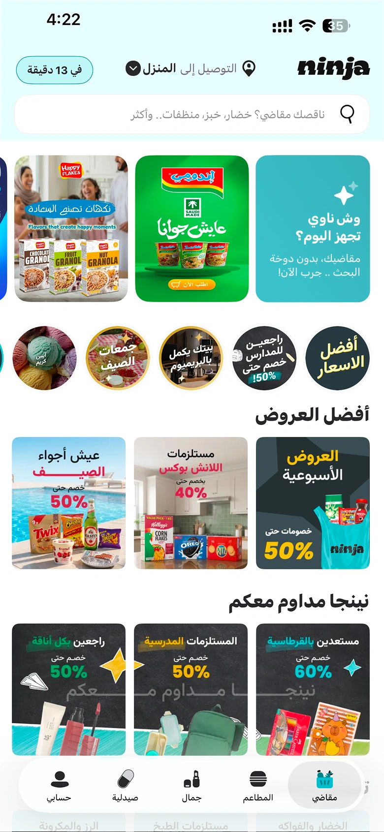
Ninja has already won the race on delivery speed. The question behind this concept: what if it also optimized shopping speed?
RoleProduct Designer
TypeSelf-initiated concept
SectorQuick commerce
01 · The opportunity
47%
of AI users in shopping use it to recommend products
That tells us something important: people aren’t looking for better search anymore. They want someone to choose for them.
Browsing through hundreds of products is no longer a helpful experience. It’s a burden. If your app doesn’t let users ask a question and get a clear answer, they’ll ask AI somewhere else, and buy from whoever gives them the best answer.
AI isn’t just helping people shop. It’s becoming part of how they decide what to buy.
45.2%of Saudi internet users used generative AI in 2025
AI shopping isn’t coming to Saudi Arabia. It’s already here.
02 · The problem
Every need turns into dozens of separate searches
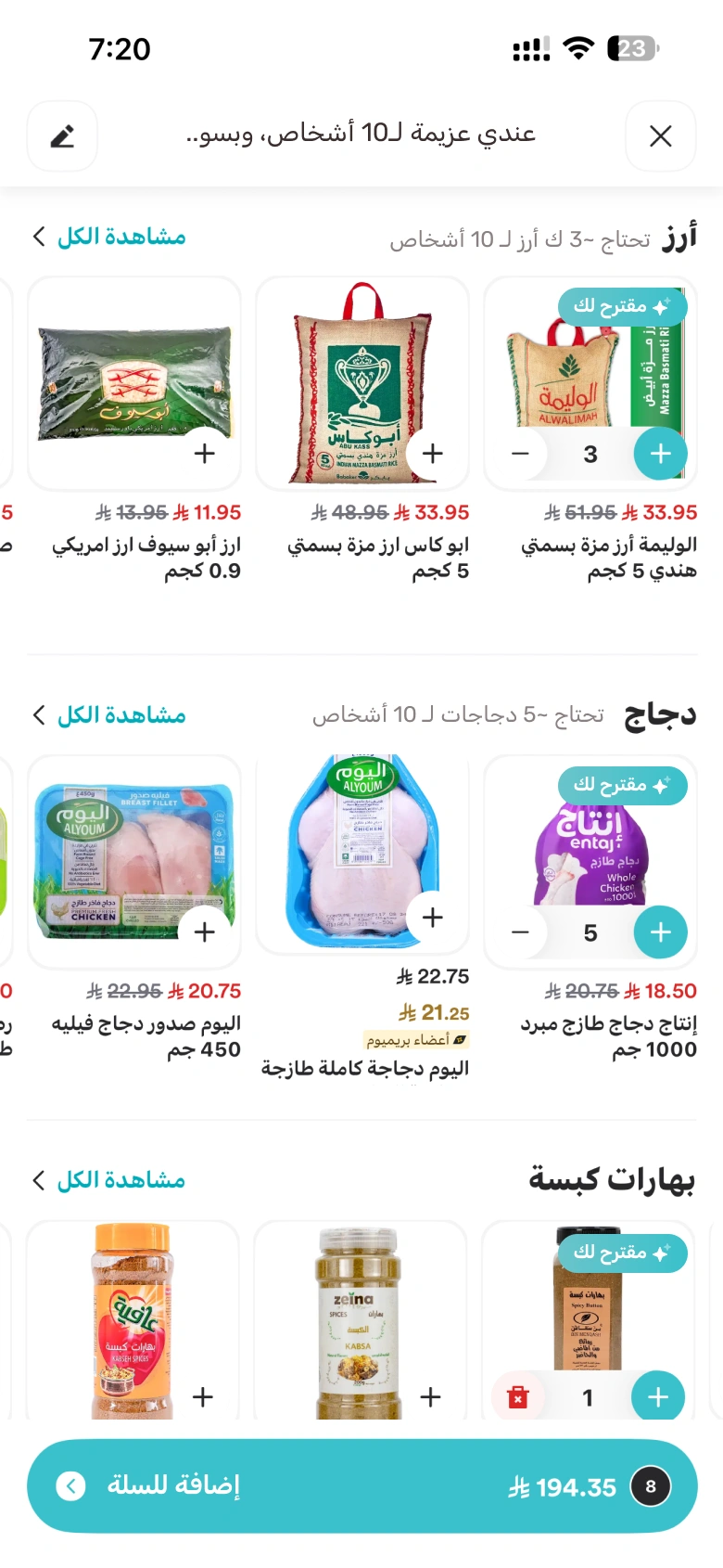
A weekly grocery list, dinner for 10 people, or a last-minute gift: each one has to be broken down and hunted for across thousands of products.
SearchBrowseCompareAddRepeat
for every single product
They have to decide what to buy, how much they need, and whether they’re making the right choice, all by themselves.
And as we have seen, users now have another option: describe the need to an AI, and let it choose.
The real risk
If users go to ChatGPT or another AI model first, the recommendation may lead them somewhere else, not to Ninja.
The problem is no longer just that shopping takes too much effort.
Ninja risks losing the moment when the user decides what to buy.
03 · The strategy
Why Ninja wins
ChatGPT
can recommend
Quick commerce
can sell
Ninja
can do both, and deliver in minutes
Ninja already has the pieces:
A large product catalogShopping historyFast delivery
But the real opportunity is the moment of indecision. When users don’t know what to buy, food, groceries or gifts, we want Ninja AI to be the first place they go.
The new shopping journey
04 · Solution and design
The entry point: start small, then scale
We explored two ways for users to discover Ninja AI.
Ninja can launch with Option B. Start with the Home section, learn and improve, then bring AI everywhere with the sticky button.
The ask screen
Users can type, speak, or simply tap an example.
Result page for a recipe and shopping list
Designed to grow AOV without taking away user control.
Drives basket value
Justified quantities increase the basket naturally
43% of last-minute gift shoppers buy their gifts from grocery stores.
That creates a strong opportunity for Ninja to capture users who need a gift but don’t know what to buy yet.
Instead of a long product list, the experience shows three curated recommendations, each with a clear reason why it fits the occasion. Each one includes a “Picked for you” product to make the decision even easier.
The goal: turn uncertainty into a confident choice, with recommendations that feel helpful, not overwhelming.
Open to new opportunities
Want to go deeper? Let's talk
Process, decisions and outcomes, happy to walk through them in person or on a call.
Designing the Saudi Accreditation Center’s digital transformation
The Saudi Accreditation Center (SAAC) is the Kingdom's national accreditation body, the authority behind the laboratories, inspection and certification bodies the rest of the economy relies on.
RoleUI Designer
SectorGovernment
StatusShipped & live
I worked closely with the business team to understand their ideas and requirements, then translated them into clear and consistent UI designs for the Saudi Accreditation Center’s digital services.
Large forms were broken into clear steps, with the option to save and continue later.
Created reusable interface patterns that made every service feel part of the same platform.
SAAC · Government
One request journey, seven clear stages
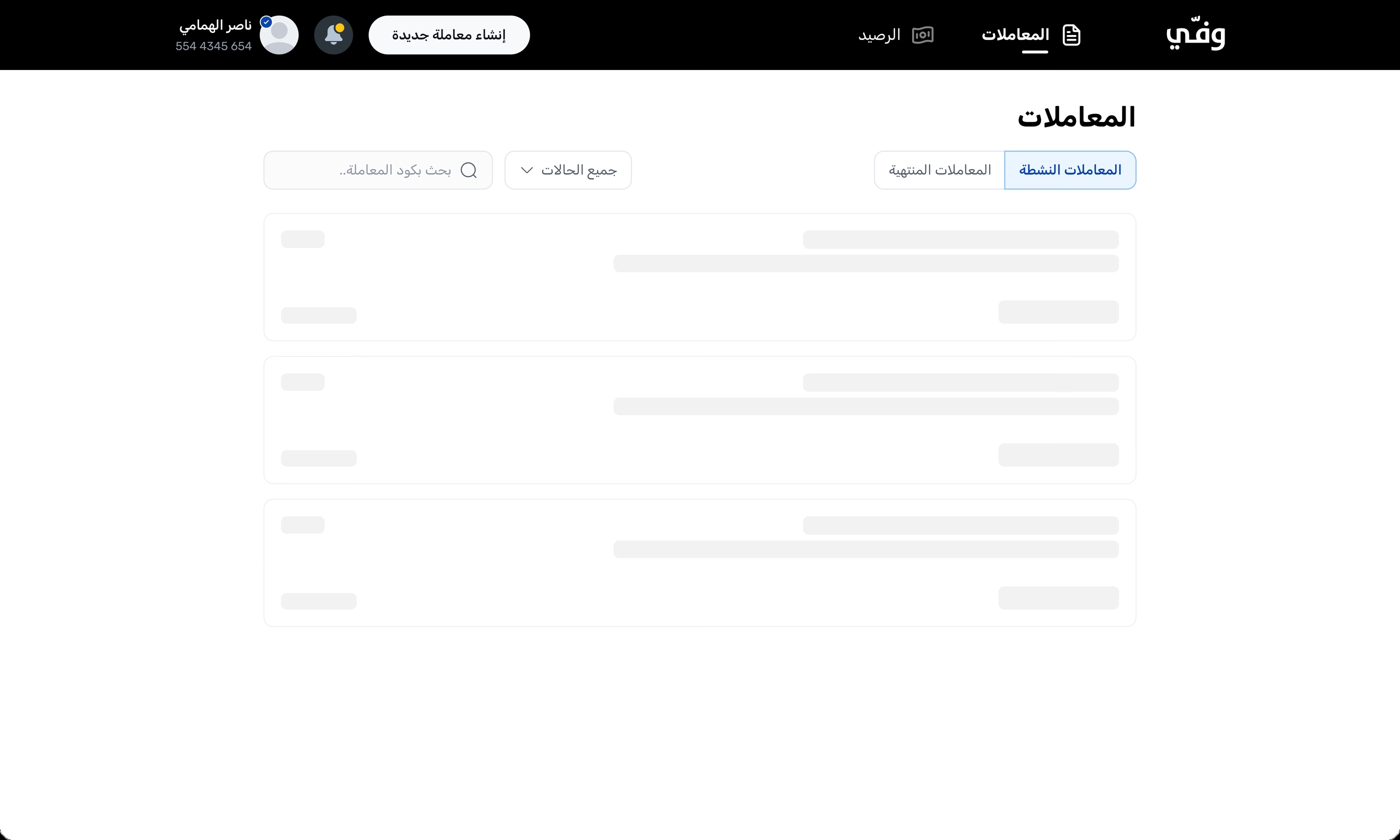
State design · System feedback
Every state designed
Clear feedback at every step
I designed loading states, empty states, and confirmation messages to help users understand what is happening and what they need to do next.
Brand · Entry
A branded front door
Proof · Official announcement
The Saudi Accreditation Center announced the platform on its official X account. The work shipped, live, published under a national authority's name.
Amen (آمن) · National Cybersecurity Awareness Program
The front door of a national cybersecurity movement
Amen is Saudi Arabia's first national cybersecurity awareness program, a Vision 2030 initiative by the National Cybersecurity Authority with the Ministry of Education and SABIC. Its landing page had one job: invite everyone (kids, parents, schools) into a subject that usually intimidates people.
RoleUI Designer
SectorGovernment
TypeLanding page
The full page
آمن, البرنامج الوطني للتوعية بالأمن السيبراني
Beyond the home page
01
The program speaks before it explains
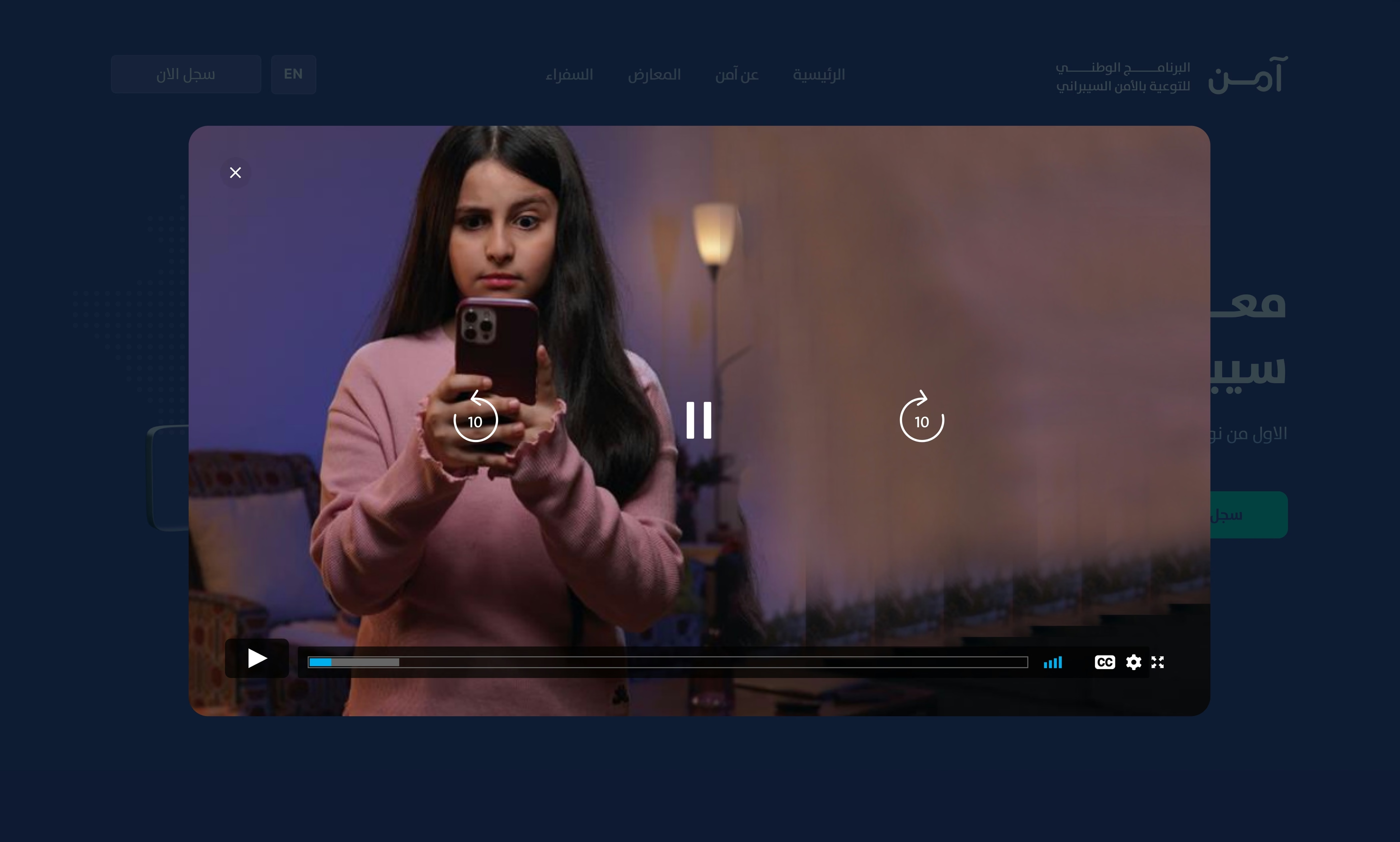
A video moment built into the experience, real kids, real devices, real awareness. Motion carries the message faster than any paragraph.
02
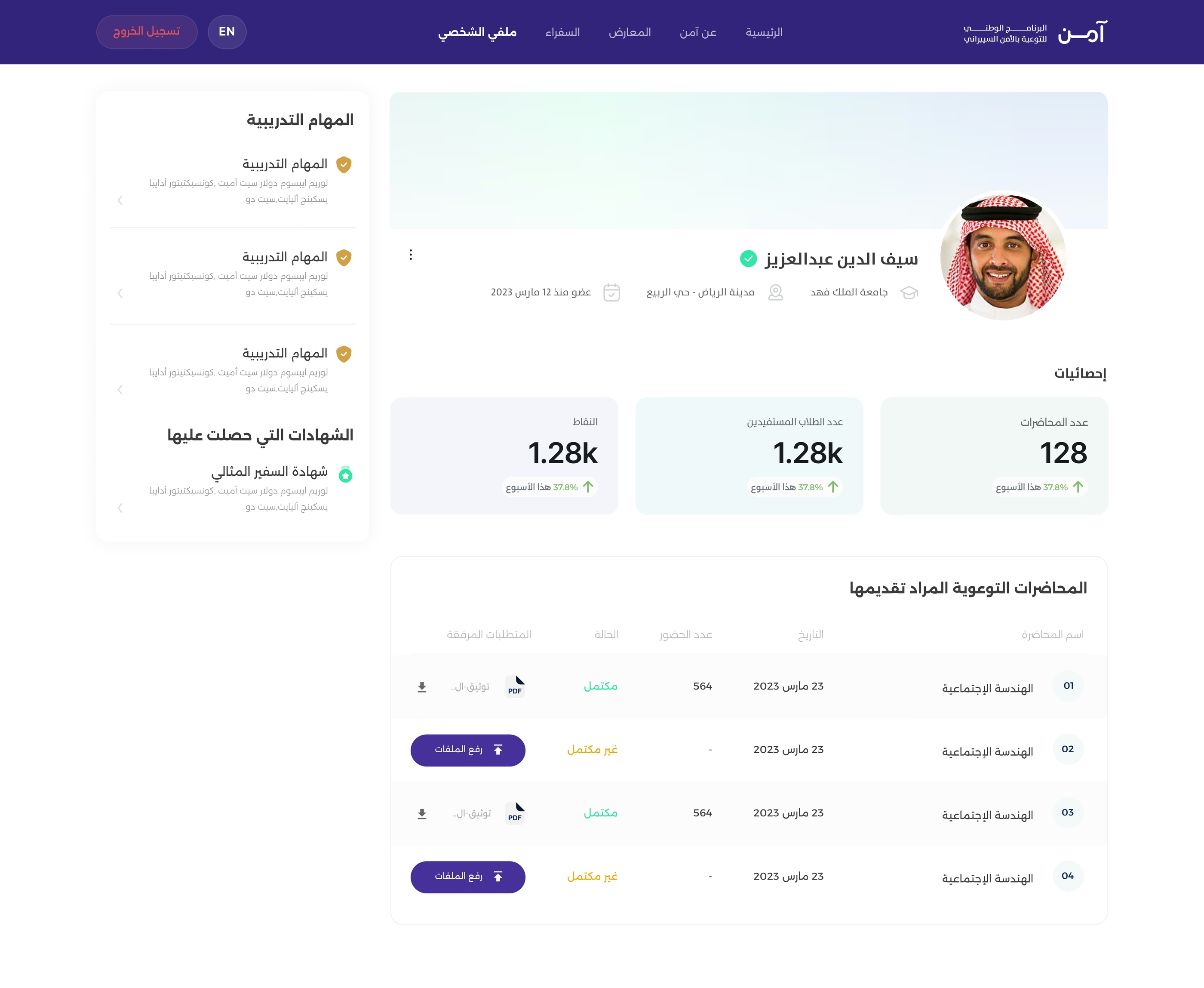
A dashboard for the program's ambassadors
Training paths, certificates and live numbers, the operational side of a national program, designed with the same clarity as its public face.
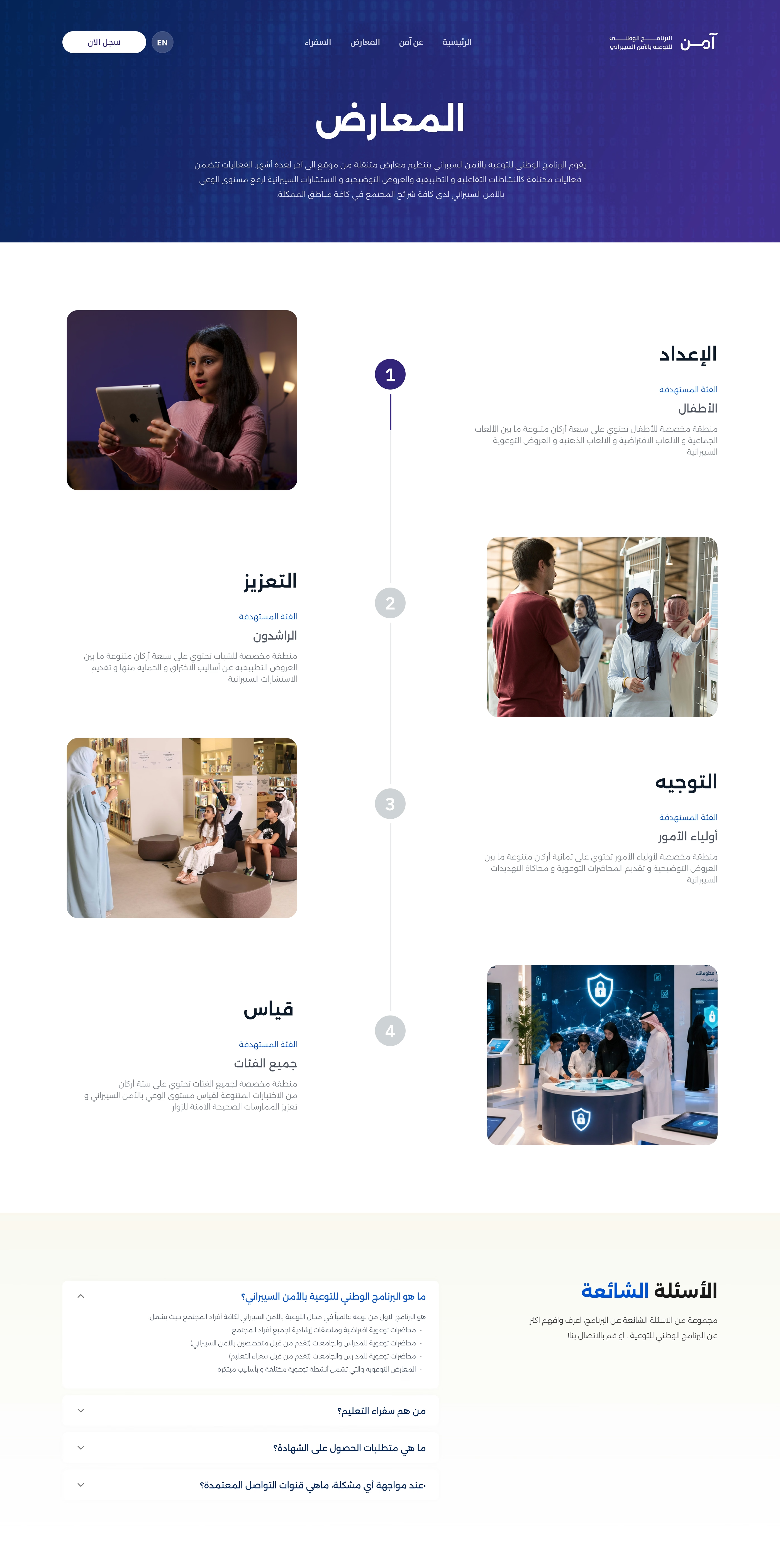
03
Exhibitions, told as a journey
Four stages (preparation, reinforcement, guidance, measurement), each aimed at its own audience, ending with the questions everyone asks.
Open to new opportunities
Want to go deeper? Let's talk
Process, decisions and outcomes, happy to walk through them in person or on a call.
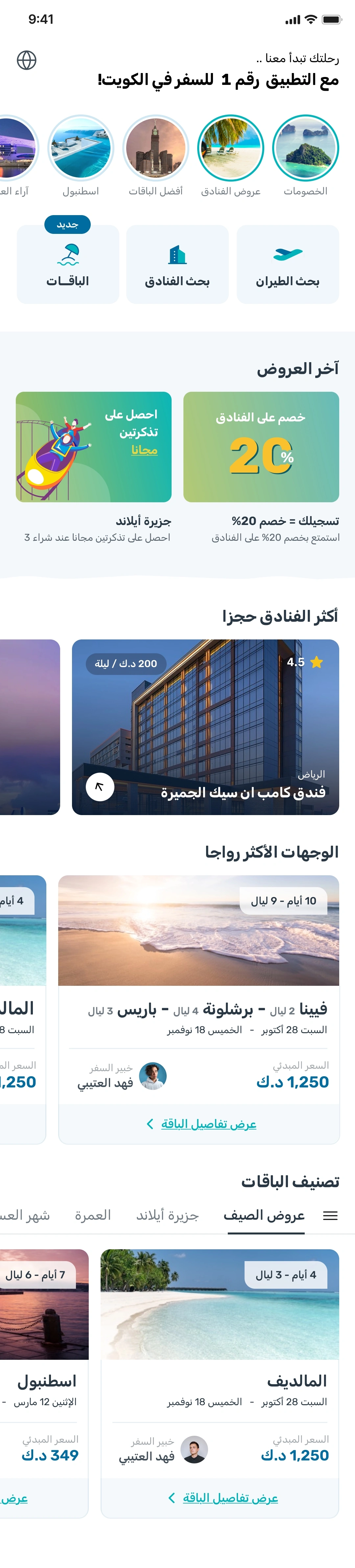
Two ways to travel: pick an expert's package, or build the trip yourself
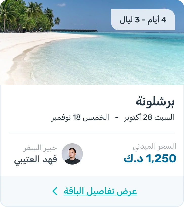
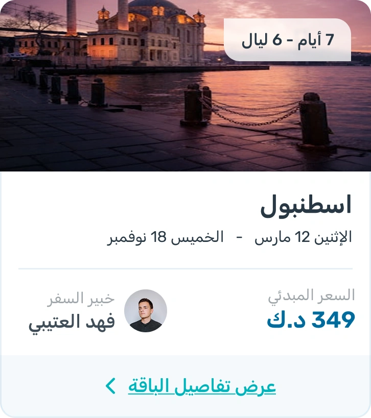
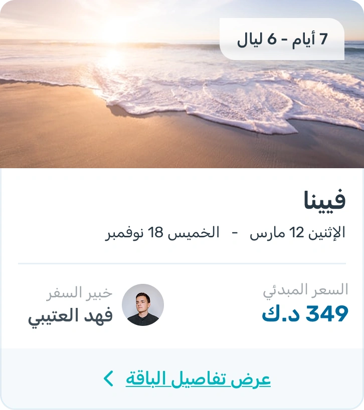
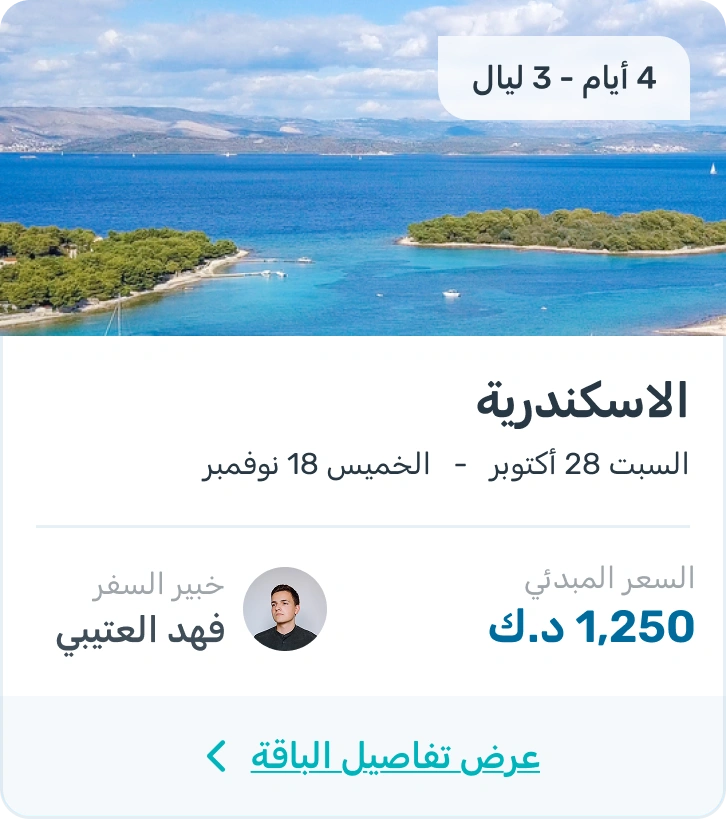
Offto is a travel app where travel experts design ready-made packages (flight, hotel and extras in one price) next to the traditional path of searching flights and hotels yourself. Two very different mental models, one app.
RoleProduct Designer
SectorTravel
PlatformMobile & web
01 · Packages
Discover a package, then make it yours
I designed a flexible package flow that lets travelers start with an expert-made trip, customize its flight, hotel, and activities, and see the updated price before booking.
04 · Marketing surfaces
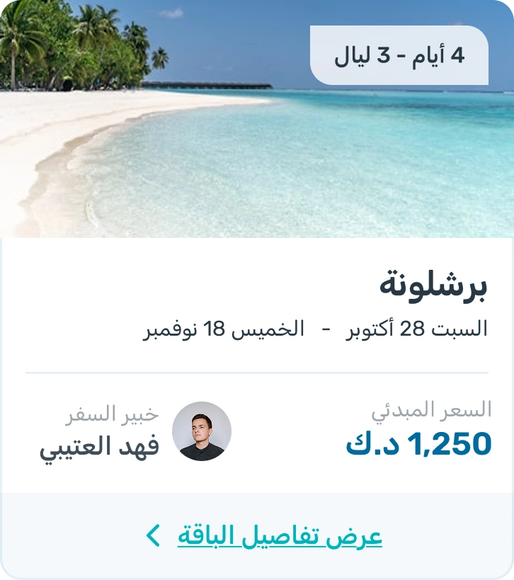
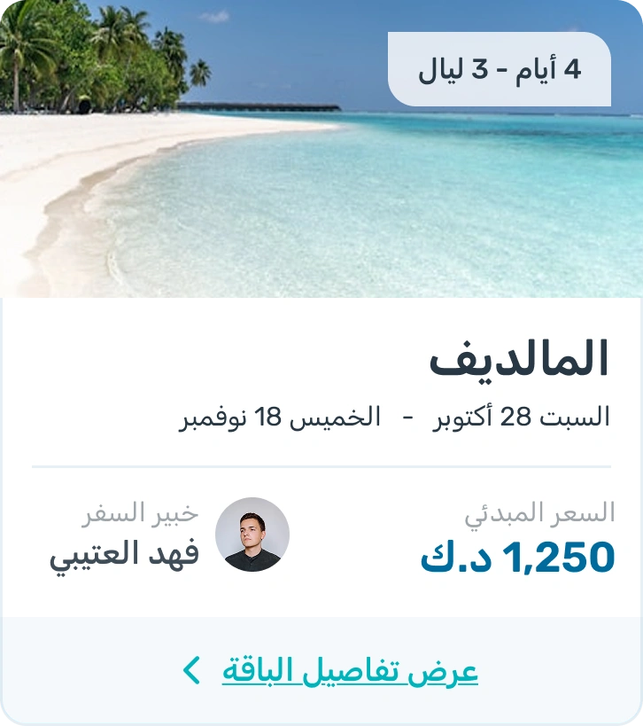
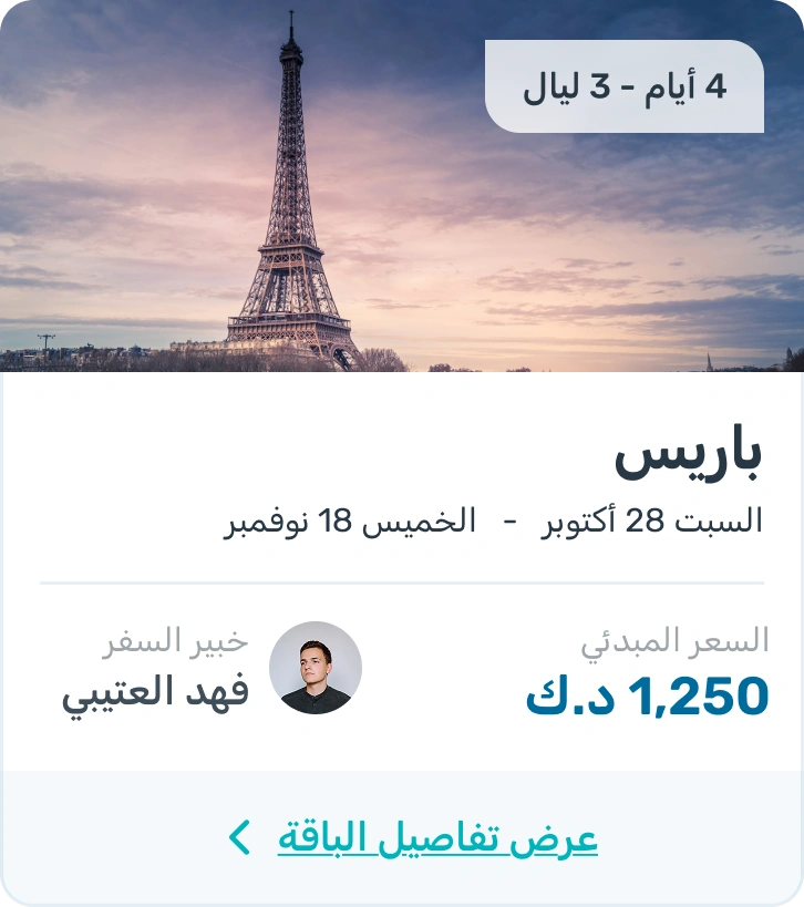
Promoting destinations and travel packages
I designed campaign layouts that helped travelers quickly understand the destination, package price, and main reason to book.
05 · Booking flow
Clear booking flows for flights and hotels
I designed the self-service booking flows for flights and hotels. Travelers can search, filter and compare options, review the full price, add extras, and complete their booking.
06 · Destinations
Packages to all countries
Before anyone knows their dates, they know where they want to go. The destinations page turns the catalogue into something you scan with your eyes: filter by region, then pick the place that pulls you in.
07 · Web
Not just an app: a full booking system
The same journey had to work on a laptop, where people compare seriously: a map view with live prices, a results list next to persistent filters, a hotel page that answers every question before the room is picked, and an empty state that tells you what to change instead of leaving you stuck.
Open to new opportunities
Want to go deeper? Let's talk
Process, decisions and outcomes, happy to walk through them in person or on a call.